Tell stories with textured data, not flat data: How $11B unicorn Checkout.com supercharges growth
March 28, 2023
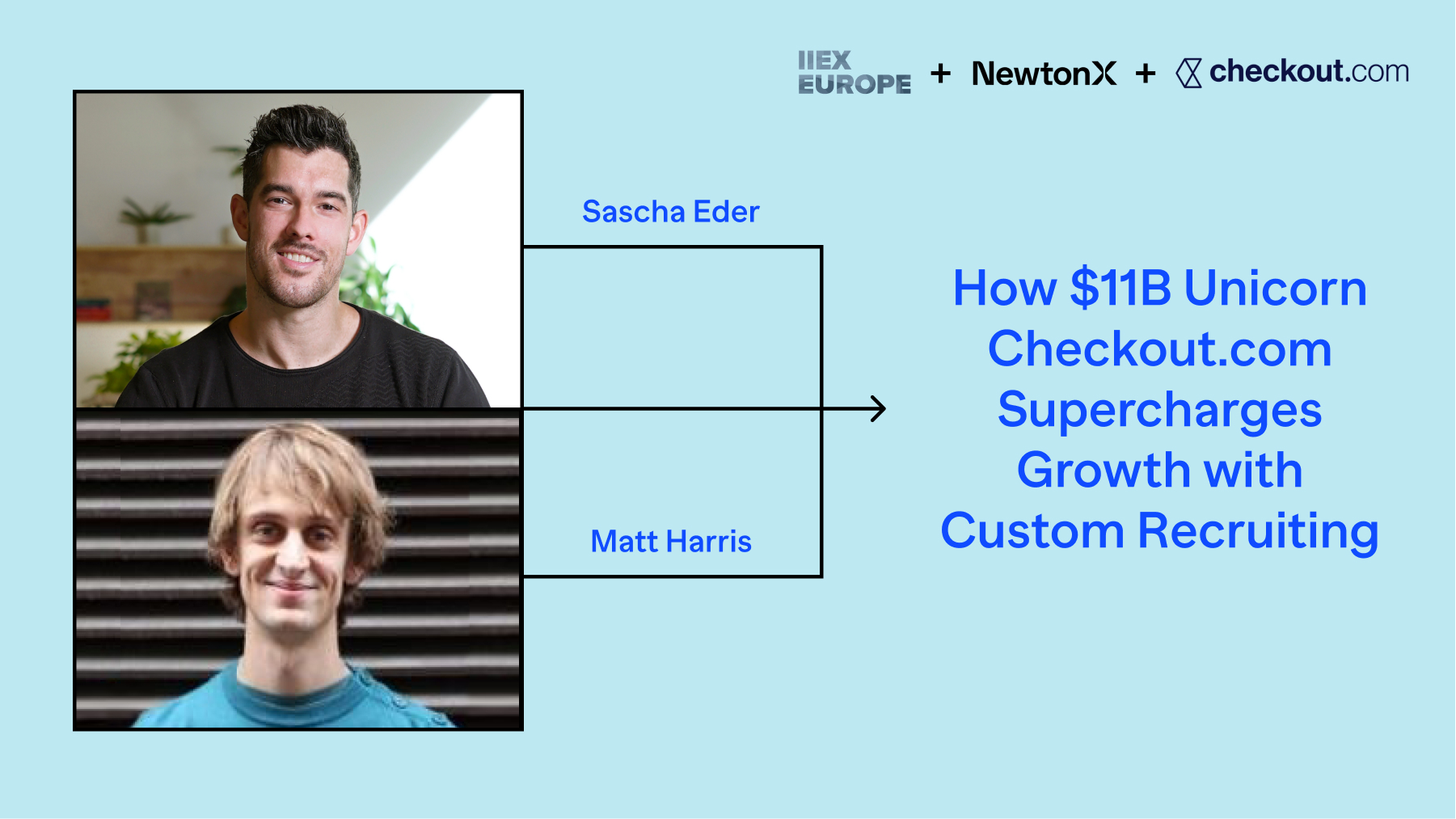
As heard at GreenBook’s IIEX Europe 2023: Matt Harris, Checkout.com Senior Customer Research & Insights Manager, and Sascha Eder, NewtonX CEO reveal how to maximize your research spend. Supported by newly released supplier A/B tests, discover the 3-part toolkit for good data: enforce data accountability with your agencies, embrace smaller and higher quality sample sizes, and run pilot projects with new vendors. Read on for an illustrated transcript of the talk.
Sascha: Thanks for joining us, everyone. Today, we’re talking about B2B research. I’d like to start with a question for you: Who has thrown out 30% of a sample? What about half of a sample? What about all of it? Okay, looks like we’re in the right room.
I’m Sascha, CEO and co-founder of B2B research company NewtonX. We leverage automation and AI to recruit professional audiences for leading companies like Checkout.com.
Matt: I’m Matt. I joined Checkout.com 2 years ago for the opportunity to build a modern insights function from the ground up. I landed here after 8 years as an agency side researcher at BrainJuicer and then a Director at Clear M&C Saatchi, specialising in strategic insights & analytics.
It’s time to be honest with ourselves about the state of B2B sample
As researchers, and particularly in B2B, we all need to be honest with ourselves about the state of B2B sample. I’ve come to a realisation, and that’s that too often in the past, I’ve looked at sample and convinced myself that bad data isn’t bad data.
And this certainly isn’t because I don’t care. Whether we’re client side or at an agency, we’re all dedicated to helping our organisations, or our client’s organisations make smarter decisions with actionable insights. Ultimately, our careers are at stake with the recommendations we make based on data — and so they should be.
But it’s so easy — when you get data back that doesn’t feel quite right — to on some level start rationalising about the data. Maybe you’ve got a presentation next week, or maybe you don’t have strong priors because you’re doing research in a new area. We think, there must be an explanation, a different way to look at this which would help me have confidence in the integrity of the data. And there could be lots of different ways we do that. Maybe we decide that the questions we asked weren’t quite right, or the survey design wasn’t engaging enough — I’m constantly hearing these things from traditional sample suppliers. Or maybe it’s that we decide our assumptions about the market weren’t right. Or maybe even that it’s just a reality of research for everyone these days.
But this is what I want to challenge. Because the reality is, oftentimes, the data can’t be trusted. The explanations we tell ourselves are just rationalisations. And I think at some level we all know that there needs to be change. In fact, according to GreenBook’s 2022 GRIT report, 57% of buyers in Europe are looking for alternative sample sources due to poor quality data.
So let’s talk about good quality data. I think we all know why good quality data is important. Good quality data gives you clear direction to tell a story to your stakeholders. That helps your business, or your client’s business, make better decisions. And ultimately that’s why we’re all here.
But today we’re going to talk about what good data looks like.
For me, there’s been multiple cases in the past year when being able to make a comparison to really good quality data has helped me be honest with myself, instead of convincing myself that bad data isn’t bad data. And that’s meant better recommendations to my stakeholders, and more confidence in those recommendations for me.
So what does good data look like?
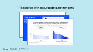
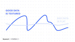
Good data is textured, while bad data is flat
Good quality data is textured, not flat.
I’ve been really hands on with all sorts of survey data throughout my career: Consumer, B2B, Healthcare; and different sources, data from panels, from intercepts, from customer lists, custom recruits, whatever you want. What struck me after working with NewtonX is the data makes so much more sense than a lot of those other datasets. And it’s because of this. There’s more variation, it’s more textured. It’s less flat.
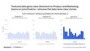
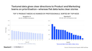
Here is real data from a parallel study that I ran with NewtonX and two other suppliers in the US last summer. Suppliers A and B are traditional B2B panel suppliers, but established and reputable. Like most panels, they talk about how they block fraud and bots from entering the survey. Both have a CPI of 30-35$. NewtonX on the right, with a much higher CPI at around $175. Importantly, the NewtonX sample is 100% verified professionals — and obviously properly incentivised. All the respondents are, or were meant to be, senior decision makers — so Director and VP level — and the same survey link. And the data here is all after any cleaning that was agreed on with the suppliers. So in the case of supplier A and B, a large chunk of data had already been thrown out and replaced.
What the charts are showing here is the data from a pretty standard needs question, so the percentage of respondents who selected a certain need as in their top 5. So in my world, this is things like ease of integration, customer support, cost, acceptance rate, whatever it might be.
This kind of needs data can be really valuable for my stakeholders in Product and Marketing, to tell them what matters most to customers in our target market. For example, what should Product focus on building and what areas should they deprioritise? Similarly, what marketing messages should we focus on?
But if I just had the data from Supplier A on the left, what do I tell them? What should they prioritise? What can they safely depriorise?
Supplier B, in the middle, is slightly better, so statements as for 4 and 15 — these are probably needs that can safely be deprioritised.
Whereas NewtonX data, on the right, gives the clearest direction. We see the same pattern with statements 4 and 15 but there’s much more variation. The data is less flat.
To illustrate this more clearly, here’s another look at the same charts, this time sorted based on the top needs from the most selected to the least.
In the NewtonX data there is a 62 percentage point difference between the top and the bottom needs. Whereas for supplier A on the left there’s much less variation — only 15 percentage points between top to bottom need.
The NewtonX data is more textured, less flat. That means that I can give clearer direction to my stakeholders.
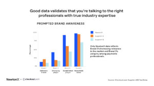
Here’s one more example from the same study. This is data from a standard prompted brand awareness question. We see a similar pattern here, with NewtonX data showing greater variation between these 4 brands — certainly compared with supplier B.
But here I think we also see a clue as to why the NewtonX data was so much more textured compared to the other two suppliers, and that’s that it looks much more like sample from genuine payments professionals, based on what we know about the market. I’ll talk about each of these brands in turn to illustrate.
Brand 1 is a more or less unknown brand. The low awareness is what you’d expect, even amongst payment professionals. The data from supplier B here is pretty close to NewtonX. Supplier A in orange actually looks a bit high, but it’s plausible.
Brand 2 – we know has higher market share. We would expect a fair number of payments professionals to have heard of them, but they’re unlikely to be known if you’re not in payments. Only NewtonX data reflects their increasing relevance in the market, whereas supplier A and B looks almost the same as the unknown brand.
Brand 3 is a well known payments brand. If you know payments, you’ll have heard of them. So we would expect brand awareness to be really high, as we see in the NewtonX data. But you might have heard of them outside of payments as well, for example if you have any interest in tech more generally. And that’s closer to what we see from Supplier A and B.
Brand 4 is a household name even if you’re not working in payments. So you’re much more likely to have heard of them even if you’re not genuinely a payments decision maker, which we see with supplier A. And actually supplier B looks to me like there’s probably some random selection going on.
The point is, NewtonX data tracks what you would expect from genuine, verified, payments professionals. And because they’re genuine professionals, we also get that much clearer variation on needs that help me tell a clear story to my stakeholders.
Sascha: Now what are the key components of high quality data for B2B insights?
There are three components:
1. Targeting ability and verification.
Survey panels are primarily built for consumer research but claim to also contain B2B audiences. What panels often do is send the surveys to their panel audience based on statistical information, but the panelists have not been recruited or vetted from the bottom up to ensure what their expertise is. So, they can claim any job title or expertise in a survey, which increases the chances of fraud.
In order to combat this and target professionals at scale, we built the NewtonX Knowledge Graph—our proprietary search engine built for B2B knowledge, which indexes over 1.1 billion professionals on their expertise and allows us to pinpoint any audience that our clients need. Since the experts get contacted by us based on their expertise, they can’t make it up.
2. Verification
Once contacted, we triple check all respondents’ identities so our clients can trust they are who they say they are. We leverage corporate email checks, resume verification and expertise checks. This also allows us to retarget professionals to gain deeper insights in follow up studies.
2. Fair compensation for their time and expertise
Finally, these are business decision makers taking time out of their busy day and their time is valuable and expense. Why would a CFO take a 15 min survey for $20? By paying them appropriate rates, you ensure you get the quality results and answers you’re looking for.
Matt: I was genuinely really excited when we found NewtonX, and I’m happy to stand up here with them. Their Custom Recruiting has genuinely been a game changer for us in terms of data quality, as you can see from some of the examples I showed. Not only do I have much greater trust in the data, but the variation in the data means I can more easily provide actionable direction for our product and marketing teams without finding myself rationalising away bad data.
So I’d like to end by sharing 3 suggestions that hopefully can help you reach the same level of confidence.
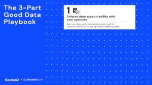
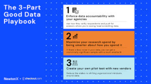
The 3-Part Good Data Playbook
The first is:
1. Enforce data accountability with your agencies.
I think there’s a fundamental misalignment of incentives between clients and agencies.
Agencies are incentivised to pitch cost effective projects, and thus use cost effective suppliers. Then when they get the data back they’re under pressure to deliver a coherent story to you, backed by the data, and usually to do so under time or resource pressure, because how many agencies can truly say they can give every project the time and focus that it deserves.
As clients, this can be difficult. Because we’re generally not spending time close to the data. That’s why we’re paying an agency. But if you’re client side, I think you have to get close to the data and then not compromise on quality.
So ensure your agency is taking quality sample seriously. Ask what suppliers they’re using and how they verify respondents, challenge your agencies when you’re seeing data that doesn’t look right, or data that’s just flat. No one should have a better intuition for what is right in your market than you. And don’t let agencies convince you, and don’t convince yourself, that bad data isn’t bad data.
That said, now you’ve demanded quality, it’s going to be over your budget, right? Well it doesn’t have to.
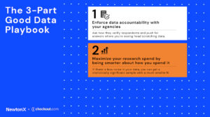
2. Maximize your research spend by being smarter about how you spend it.
Which brings us to our second point.
Maximise your research spend by being smarter about how you spend it. If you’ve got good quality data, you probably don’t need as big of a sample size as you think.
If there’s less noise in your data, you can get a statistically significant and valid sample with a much smaller N. So 70 spot-on, genuine professionals is better than 200 people who are off the mark. Reset how you think about sample size and you may find that you can deliver valuable research to your stakeholders for less than what you thought you needed.
Let’s assume that you agree with that. But you might find you still have reservations, or you’re getting objections from your stakeholders internally, because people do find a large n reassuring. It does take a mindset shift away from cheap, flat data towards quality, verified data. So a final point that might help:
3. Create your own pilot test case.
Run your own pilot test with new vendors. This is what we did.
If your organisation is used to bigger samples at 5x less the cost, maybe they’re still convincing themselves that bad data isn’t bad data. So just take a small portion of your overall sample and give that to a quality sample provider.
You’ll know what good quality data looks like for that particular study, you’ll have a gold standard to compare other suppliers to, and you’ll have at least a portion of your total sample that you have 100% confidence in. And in time, that will help shift mindsets for you and in your business.
Sascha: Thanks Matt. We’re excited to share this and equip research leaders with the data theyneed. We’ll share these slides with the A/B tests on our website. With that, thank you for your time. We’ll open it up for questions now.
Your playbook to making confident business decisions enabled by B2B research. Expect market research trends, tools, and case studies with leading enterprises, delivered monthly.
Introducing the Product Research Lifecycle: your winning framework to discover the questions top product, marketing, and UX leaders ask at each stage of the development cycle, from launch to market expansion.
This website uses cookies so that we can provide you with the best user experience possible. Cookie information is stored in your browser and performs functions such as recognising you when you return to our website and helping our team to understand which sections of the website you find most interesting and useful.
Strictly Necessary Cookies
Strictly Necessary Cookie should be enabled at all times so that we can save your preferences for cookie settings.
If you disable this cookie, we will not be able to save your preferences. This means that every time you visit this website you will need to enable or disable cookies again.